Original heat magazine 


My copy of heat magazine
First , I tried to re-create the title from the Original heat title which I tried to get the closest font to and then made a drop shadow on it to make it look similar and more dimensional. I then made the red box and the 'PLUS!' writing to get used to using text, I changed the colour and got a similar font and then added a slight drop shadow on it. I also created the arrow and changed the colour of it so it was as close to the original as possible. I created all the text first and then moved it around once the pictures had been added.

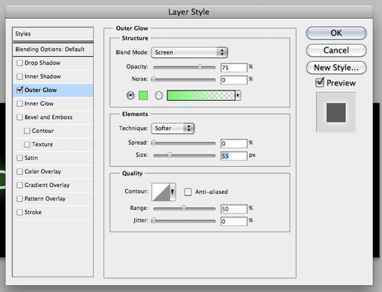
 When I added the photo, I cut out the heads out using Polygonal Lasso Tool to go round their heads as close as possible, then I used the blur tool to make the cutting out more smooth. I then repositioned the main picture to place it over the head as close as possible to the original. I then created a rectangle with the text over to have a yellow background and black font. After doing all the smaller images and using outer glow to give it a border, I then put the text over in place.
Then I did the top images and placed the text and barcode over them in the place they're in on the original. I then put everything in place where it was and then added drop shadows where they were needed and the rest of the text which was needed like above the title and at the side of it.
For each magazine you have a title and masterhead and a barcode. You always have a cover star photo covering the title of the magazine somehow. The website address of the magazine goes on the cover.
To make my magazine better, I need to improve on cutting out round the heads as they're a bit untidy. If I find pictures that are closer to the original then it will be better as the shapes will be better.